Weak hierarchy
The logo, title and service groups competed for attention, making the reading order unclear.
Bloom Lane Clinic / Local Design Pack / Service menu
A local beauty service menu made easier to scan, print and reuse across booking touchpoints.
Project Overview
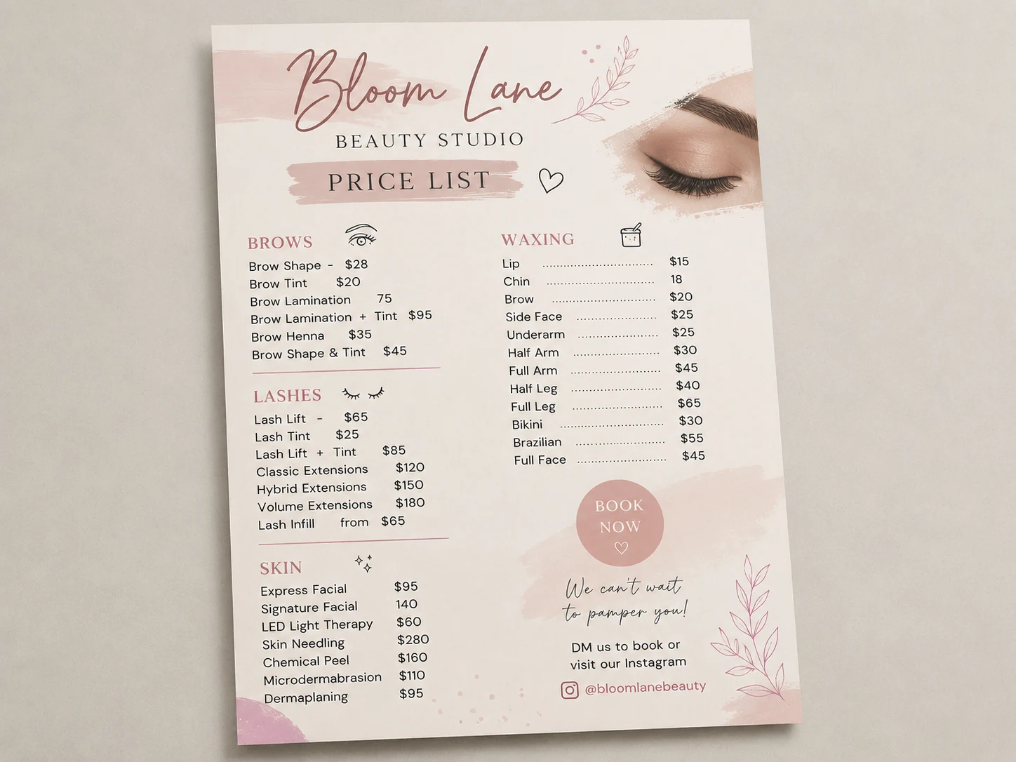
Bloom Lane started with a useful price list, but the information was difficult to scan quickly. Services, add-ons and prices were present, but the layout made comparison harder than it needed to be.
The fix focused on clarity, price alignment and booking confidence, not a full rebrand.
Original Asset
The original price list had the right information and a soft studio tone, but service groups, pricing and booking details needed a clearer system.
Visual Diagnosis
The diagnosis translates visual feedback into practical service-menu decisions: reading order, comparison speed, grouping, noise reduction and the booking path.
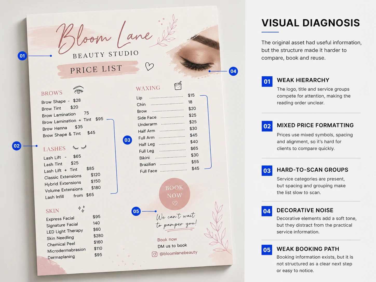
The logo, title and service groups competed for attention, making the reading order unclear.
Prices used mixed symbols, spacing and alignment, making comparison slower.
Service categories were present, but spacing and grouping made the list harder to scan quickly.
Soft decorative elements added tone, but distracted from the service information.
Booking information existed, but it was not structured as a clear next step.
Fix Direction
Four practical decisions turn the same information into a calmer menu clients can compare, trust and book from more quickly.
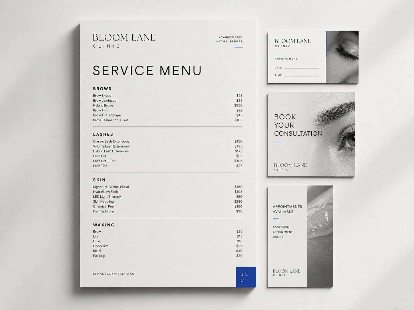
Brows, Lashes, Skin and Waxing were separated into clearer sections.
Prices were moved into one consistent comparison column.
Booking details were moved into a stronger footer action.
Decorative elements were reduced and replaced with a sharper clinic-style system.
Final Direction
The final layout gives Bloom Lane a sharper pricing structure and a more professional booking asset system for print, front desk display, appointment communication and online touchpoints.
What Changed
Services and prices were present, but difficult to compare quickly.
AfterServices are grouped clearly, with consistent price alignment.
Booking information felt secondary and informal.
AfterThe booking action is clearer and easier to notice.
Decorative elements competed with the practical information.
AfterThe layout feels calmer, sharper and more professional.
What You Could Receive
Need something similar?
Use this route when the asset already exists and the useful next step is clearer hierarchy, spacing, pricing and booking flow.